Summer is well and truly underway and flora and fauna is everywhere! It's easy to cruise on the highway or stay in the city and not see the different colours that surround us. The concrete jungle, suburbs and roads take over our lives and we just seem to take one of the most beautiful colours for granted.
So in celebration of green, I'm taking a quick peek at four of my favourite fountain pen inks! J. Herbin delivers exciting inks with a varied range of colours and the vast array of contrast, saturation and shading. Their greens inks are no exception.
Take a look at these four delights and enjoy a palette of green!
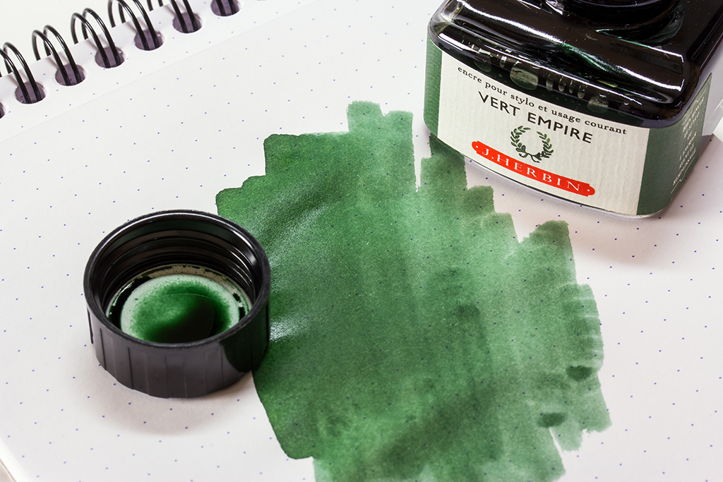
Vert Empire, Empire Green
Napoleon Bonaparte was crowned French Emperor on December 2nd 1804 at the cathedral of Notre Dame in Paris. Bonaparte crowned himself Emperor by taking the imperial crown - in the form of a laurel - from the hands of Pope Pie VII.
In celebration, J. Herbin created this beautiful leafy ink. You'll find the dark colour of the ink adapts itself well to formal situations. The ink is a little watery and feels light when applied to paper.
Suffice to say Vert Empire darkens with age and gives a good amount of shading, moving from lighter grey to deeper green tones. If you like highly saturated inks straight out of your pen with little shading, then this might not be the ink for you.
But if you like a green ink with a lot of character and interesting tones then Vert Empire is sure to be a winner.
Lierre Sauvage, Wild Ivy Green.
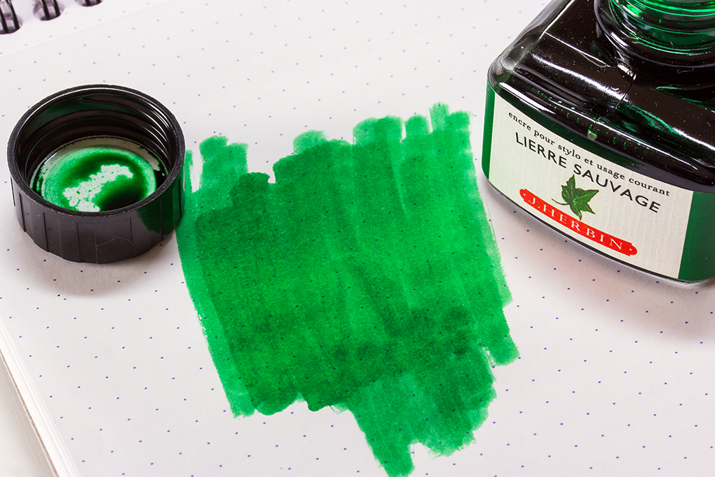
Wild ivy green is spot on for this ink! It's wild! It's bright! And it looks.... ivy like! The ink is brighter than some you may find and presents an extremely solid colour but still delivers a great amount of shading.
Lierre Sauvage is a perfect green. You won't see any other colours interweaved here, just pure green. The ink flows well but it's not overly watery, it dries quickly and behaves well with little smearing or smudging.
Imagine a sea of ivy growing over an old house and you know how Lierre Sauvage looks on paper. This is a reliable green that works with any nib. Looks to me like a keeper!
Vert Pre, Green Prairie
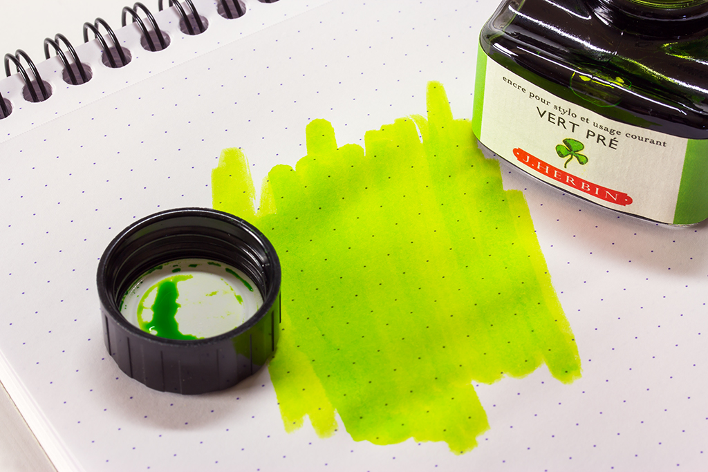
Imagine heading outside when the last of the snow is on the ground. The weather is warming and plants are starting to show some colour. Vert Pre represents fresh spring green. The colour of new grass growing right after the end of winter.
This vibrant green ink is too light for some, but has a good shading and is extremely fun! Use a medium or broad nib to put more ink on the paper. Some may find Vert Pre tricky to read with a finer nib.
You could also consider using the ink for highlighting or just enjoy a unique colour that no one else at the office owns!
Vert Olive, Green Olive
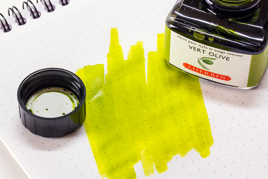
I used to snack on potato chips before I found olives! You may like them in a bowl or a Martini, but be sure not to munch on Vert Olive. Better to use this wonderful ink in your favourite fountain pen.
Vert Olive is another J. Herbin ink that flows well, but with a lighter colour than you guessed it would be... give it some drying time and you'll find it darkens with age.
The ink is well behaved and dries quickly. Similar to Vert Pre, some might find it a little difficult to read. I tend to use it with a medium or broad nib to give more coverage.
If you can't bring yourself to write with this classy green ink then sketch an olive - they look almost good enough to eat!